Corporate websites are more of a challenge to the designer than the usual business to consumer variety. Of course, both have their own challenges but we at Complete Web Graphics pick the former because of several reasons. For one, these websites have to toe a very thin line between professional and boring! You cannot have the website in flashy colors; at the same time, you cannot make it look too dull and unimaginative.
To hit the balance right, you need excellent professional web designers and skilled craftsmen to pull off the job. Before you actually make the final draft, here are some pointers that you can check out. It will help you crack the puzzle without making too many changes to the web design that you have already conceptualized and created.
Look at the text. Is the font too small? Sometimes, the smaller fonts look fancy and even creative but they are not very practicable for long readings. Corporate websites are surfed by people who mean business. They will pore over the words you put up on the website. As a designer, you need to have a font that makes this reading easy. Additionally, take care to use not more than 3 fonts on the web pages. It would be great to stick with just 2. Too many fonts spoil the professional look of the website, going to the extent of making it look frivolous.
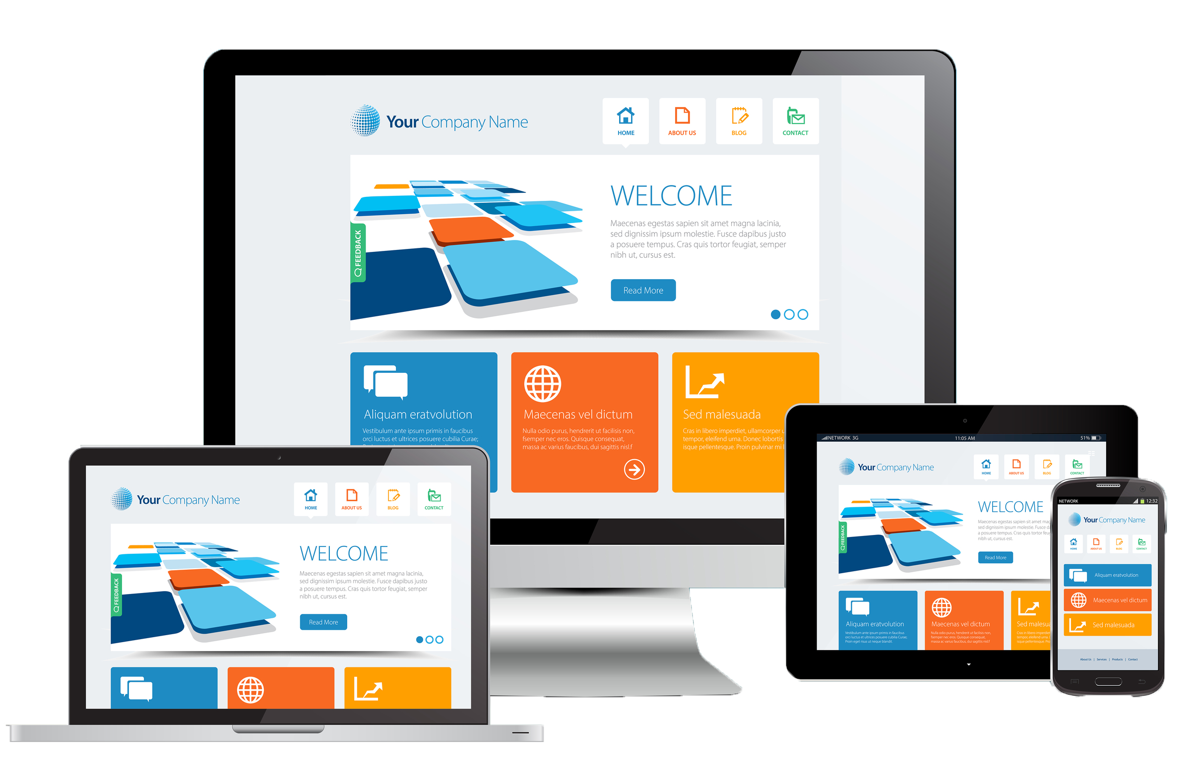
Create a website that works on mobile devices as well. Mobile versions of the website must look as appealing to viewers, if not more. You can never be sure how many corporate bigwigs are checking through your website on their way to the office in their car. You cannot build a site which looks kitschy on their mobile devices like smartphones or tablets.
Work on the visual hierarchy of the website designs. It is a term that stipulates how a user browses through a website in the visual sense. The more important spaces in the visual pecking order of the web page should contain the more important web links. Normally speaking, a viewer browses through a web page, top to bottom and from left to right. So, the more important links on the web page should feature in this zone, depending on their importance. For example, call to action buttons do best on the top right hand corner of the web page.
It is important to understand these dynamics to get more out of the corporate websites that you design.